Chat with us, powered by LiveChat
CAll Us: 1-877-240-0580 Submit Ticket   Login
Does your website work on Mobile?

Does your website work on Mobile?

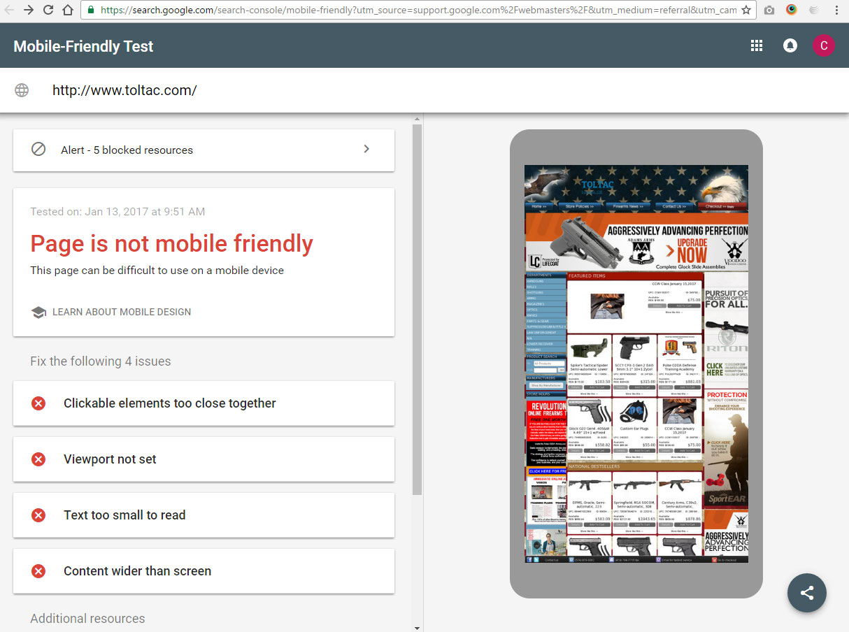
If the above picture looks like your website, you need to read this! If your website does not work on mobile, it does not work!

  • 56% of all consumer internet traffic is now from mobile devices
  • Mobile traffic is growing at a rate of 53% each year
  • E-commerce sales will reach 500 Billion by year 2018
  • Mobile retail sales have increased 25% year over year
  • 81% of top search engine results are mobile friendly
  • 48% of consumers start their buying process at a search engine
  • 33% of consumers start their buying process at a branded website
  • 72% of consumers want mobile friendly websites
  • 62% of millennials feel that online content drives their loyalty to a brand
The statistics don’t lie. If you are a retail or manufacturing B2C business in 2017 and you do not have a mobile friendly website, you are losing. In order to win the the smart-phone era your retail website must be mobile friendly, if not mobile targeted. The fact is your customers are now finding and judging your business more than ever based on your internet presence. If you have an old and outdated or non mobile friendly website almost 3/4 of your potential business is being lost to a competitor who has a better web presence.

Now lets talk about your brand. It is proven that your brand strength now impacts your search results and your customers engagement and loyalty to your business. If you are using a shared ecommerce platform or a 3rd party selling platform, you are not building your brand, you are paying to build someone else’s, possibly your competitor in the future. If your website does not strongly represent your brand and engage users with it, you are once again, statistically losing money.

The cold hard fact is, you are losing $$$ and negatively impacting your brand by not being mobile friendly. You get what you pay for.

This day in age, up to 50% of your business can be driven by your internet presence. If you are not investing in ecommerce and branding at the same or greater level than you are in your retail brick and mortar, you are making a mistake. Would your brick and mortar store have a good retail presence if you spent only 100 bucks a month on rent? The answer is no, unless you are renting space in Siberia where no customers will ever find you anyway. Think long and hard about where you want your business to be in the next 3-5 years and how your brand and technology will impact your business, then ask yourself what area of your business you should invest in?

Need to find out if your website is mobile friendly or not? Google has a tool for it here: https://search.google.com/search-console/mobile-friendly

Here is an example of a website by another company that is not mobile friendly:

Look familiar? Contact XLEcommerce. We are here to help you!

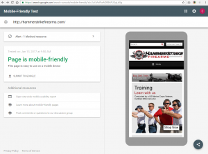
For comparison here is an example of an XLEcommerce mobile friendly website in Google’s mobile friendly test:

Statistics from:

www.smartinsights.com

www.internetretailer.com

searchengineland.com

searchenginewatch.com

E-Commerce Conversion Rate – 10 Cheap & Easy Ways to Improve

E-Commerce Conversion Rate – 10 Cheap & Easy Ways to Improve

10 Cheap and Easy Ways to Improve Your Website’s E-Commerce Conversion Rate

Odds are, if you are reading this, you don’t have hundreds of thousands of dollars to invest in e-commerce conversion rate optimization for your website. Heat maps, eye tracking, focus groups, A/B testing, and a dedicated team of marketing analysts and UI/UX designers may be a bit out of your league. That’s OK, there are some simple things you can do which can make a big difference in your bottom line.

  1. Make your landing pages look good: Trust is a big part of conversion. In order for your online customers to feel confident purchasing from you online, you need to have a trustworthy landing page. Get rid of anything out of date or unprofessional. You all know what we mean: that big red/bold/Arial text you typed on your home page, those flashing animated yellow gifs, the low quality photograph of your dog. Follow the example of the top e-commerce retailers, and make your landing pages look like a business your customer can have confidence in. Build your brand trust!
  2. Use calls to action: Make it easy for your buyers to know where to click to get to where they need to go. Think of the banners on your website as greeters in your store. Make your graphics say, “welcome to our store, let me help you, follow me” without actually saying it. “Shop Now”, “Learn More”, and “Click Here” buttons do actually work, use them but don’t overuse them. Once again, if your web page is full of flashing yellow “click here” animated gifs….refer to number 1.
  3. Streamline your navigation: Think of your website like your brick and mortar store. You wouldn’t let your customers walk through your back room, right? Make sure you have organized “aisles” and “departments” on your website that customers can easily surf through.
  4. Add unique expert content: Great unique content is not only good for SEO and getting people to your site, once they are there it helps build trust. Brand trust has a great effect on conversion. People will buy from your company because they like your company. A great way for people to get to know your business is to tell them stories about your passions, products, and experiences. When your prospective customer sees you as an expert, they will be more confident clicking the buy now button.
  5. Cut down your product list: Believe it or not, sometimes more products on your website can actually deter conversions. If you give the customer too many options, they may not be able to make up their minds. Think about turning off your low margin/low volume products.
  6. Remove barriers from checkout: Get the bare minimum amount of information you need to complete the sale from the customer, and nothing more. You can always seek additional information and follow after the sale is complete. Customers don’t want to jump through hoops to get the sales process moving, so if your fraud protection settings are too high or you have too many check boxes for newsletters or add on items in your checkout process, you could be losing out on sales.
  7. Use product reviews: Product reviews are a huge part of getting the customer to click the add to cart button. If your products have no reviews, your customer may not buy. It is OK to write your own product reviews, as long as you are up front about it. Encourage your customers to write reviews for you by giving them an incentive to do so. Have you thought about creating your own video reviews?
  8. Make returns easy: We all know returns are a hassle, and no one likes them. Not you, not the customer. New customers always have the question of “what if my order isn’t right?” Don’t give your customers a reason to not buy from you. Outline a clear return policy that makes things easy for your customer if things go wrong. They will feel more confident that if the worst case scenario happens with their order, you will back it up.
  9. Give simple shipping options: Most retailers are afraid to loose money on shipping costs. Often to combat this they show every shipping option under the sun. Customers want simple, so give them just a few options at checkout. Usually you will win some and lose some when using flat rate shipping. Remember, you can always adjust your shipping rates as you go after you gain a true knowledge of what your actual shipping costs are.
  10. Answer your phone: This is the #1 way to increase the e-commerce conversion rate of your website, and something most do not factor in calculating their online conversion rates. Many times first time visitors to your website will pick up the phone to call you. This is where you can beat out the big box stores. Make sure to provide a phone number on your website. Talk to your customers on the phone, maybe even take their order over the phone the first time, then you can turn them into an online buyer after they trust you!

Need more help optimizing your e-commerce website for conversion, contact us at https://www.xlecommerce.com


Ten Benefits of Search Engine Optimization in our Modern, Connected World

In this age of social media, you probably have heard that “pushing for content” is the greatest way to attract customers to your business. Everyone is focused on getting the most number of shares, the highest number of engagement, the “top post” that will spike to going viral.

Yet computers and patterns of techniques still drive the backbone of the internet. Facebook uses specific methods of identifying good content that might be relevant on someone’s news feed. Google uses someone’s personal search history to identify both geographic and tailored results, but even these depend on semantics. In fact, as more content, more stores, and more websites pop up, the greater need our world will have on sorting this vast information in a form that computers can understand.

The death of Search Engine Optimization is greatly exaggerated. While the old method of “just backlinks” and pure keyword-based optimization is long gone, search engine optimizers have survived a seismic shift in the complex way that the internet sorts itself. Here are ten ways in which optimizing your website can still benefit you today, which also illustrates just how complex and encompassing this field has become.

  1. Audience. In a social world, trends are increasingly defined by the masses, and often, knowing just who to target is extremely difficult. Through keyword research, social trends, shopping statistics, we can help you find the right products and content your business should be selling. Words go in and out of style, but research will always hold its value.
  2. Ideas. Brainstorming can be a chore, especially when you are jump-starting a new business or trying to add to an already existing portfolio. Yet with an SEO advisor, analysis reports and tools can give you insights into what has worked well so far in the world. This can even tap into your competition, allowing you to see how others have fared and provide you with a branch of generating new ideas.
  3. Organization. Spammy pages are scattered, cluttered, and not well organized. They use improper page layouts, untagged images, and promote chaos in an already chaotic online world. Optimizers ensure that your pages and products are organized, with the proper mark-up that both humans and computers can understand. How do your pages connect to other related pages? Do they convey a natural flow of information? We consider this and many other minor factors when ranking.
  4. Go local. With local targeting through keywords, directories, trends, it’s easy to know what your geographic target is looking for. The rise of smartphones means that more than ever, people are searching in their area for products.
  5. Strength. The internet has given rise to many forms of content and forms of sales. Contests, types of promotions, webinars, animated videos and guides, monthly product magazines, different forms of catalogs… It can be overwhelming to choose. Keywords alone don’t cut it for good SEO, we must have insights into more detailed specifics that engage your brand in a strong way. The stronger your engagement, the greater importance you’ll be on the internet.
  6. Authority. Generating backlinks is no longer as easy as asking someone to place a link to your business on their site. Authority is gained by the right shared content, well-written reviews from customers, and curated information.
  7. Universality. SEO ensures that your website is usable not just on tablets or desktop computers, but also on any other smart appliance. Like it or not, the internet of things trend has taken off, and over time there will be opportunities to showcase your business on other forms of technology. It’s also important that people with diverse backgrounds can access your website.
  8. Speed. Believe it or not, Google factors in page load times when it ranks your site. Where and how can we improve your page efficiency?
  9. Submissions. While Google is still the #1 search engine, people are also using other websites for searching. Each engine has their own unique way they crawl the web, and knowing how to work with the big guys will place you in good territory with the internet.
  10. Efficiency. As a business owner, your job is to focus on the business and sales. Through search engine optimization, your efficiency can grow without much overhead from your company. Optimizers work with and for you, not against you to create the best e-commerce experience you can have in today’s age.

Is Your Site Mobile Friendly?

Have you been dragging your feet on a mobile version of your site or upgrading to a responsive template design?  If you have, you are not mobile friendly and it could affect your traffic and sales in the future.  Beginning April 21, 2015 Google will begin incorporating your sites mobile-friendliness into its ranking algorithm.

If your answer to the question in this articles title, Is Your Site Mobile Friendly?, is no, then you need to take some immediate steps to move in that direction.  Here at OBN we have approached mobile in a few different ways over the years.  We have always known that mobile would be the preferred interface of customers in the future, and since 2008 have taken steps to optimize our solution for mobile users.  Aligned with the likes of Amazon and Ebay and other major retailers, the OBN approach to mobile has been to develop mobile specific website versions and designs.

17% of firearms retailer website traffic comes from a mobile device.

Our Basic and Gold level solutions have the option for a mobile version of the website.  This slick little add on not only changes the way the site is viewed on mobile sized devices automatically, it also allows for a complete mobile specific website and interface customization.

Our legacy (V5 and below) Ultimate level platform has always had an included mobile version.  Some users may not have turned it on yet, but if you haven’t, you should. The new OBN CloudCommerce V6 Ultimate level platform has two native mobile options.  It can utilize the embedded mobile site, or choose from a selection of responsive e-commerce templates.

The time has come to make sure you have a mobile plan, not only for your users ease of navigation, but also for SEO.  As this is now a ranking factor, your site will be left behind if you do not make the appropriate accommodations.  If you aren’t sure of your websites status, Google provides a tool to check your website here: https://www.google.com/webmasters/tools/mobile-friendly/

If you need  help implementing a mobile solution contact us today and we will get you moving in the right direction.

Get Personal and Standout: Tell Your E-Commerce Story

With so much emphasis on the internet today we often lose that personal touch of “small business”. More and more people are looking to online stores to get what they need and many retailers don’t think about ways that they can give their customers a personal touch to set them apart from the billions of other retailers out there. Here are a few ideas that bring back that special something that people seem to be missing from brick and mortar stores.


1. Tell Your Business Story

Consumers want to know who they are buying from so why not share your unique business story? Let people know who you are and what you stand for so they can see that your business is actually real people doing real work. Make sure your information pages have an “About Us” that is well written and includes pictures so people can connect with your store on a personal level, something they can’t get from a big box store.

Learn how here:

2. Send a Personal Thank You

This is a little extra effort that goes a long way. Sending a short and simple “thank you” to customers after an order will not only make them feel important but it will reinforce the idea that they are buying their product from real people dedicated to their business. If you are sending an item from your store you can drop a thank you letter in the box before you ship, or if you are drop shipping you can send a digital thank you with your order confirmation using the comments box on your order page.

Learn how here:

3. Reach Out to Your Customers

Much like you would greet your customer walking into your store, you can use newsletters and special coupon codes to reach out and say hello to your best customers. Keeping your store fresh in your customers minds will keep them coming back for business and maybe even get you referrals. Use tools like Who’s OnlineCustomersCoupons, and Newsletter to reach out to your existing customers.

Learn how here:

Who’s Online

Customers

Coupons

Newsletter

Email Marketing Part 3: Analytic’s & Overview

Welcome back to final part of this Email Marketing topic where we will be going over what do look for after you’ve already sent out your customized newsletter.  Going over and looking to see your email lists reaction is crucial to consistently improving and having a successful newsletter.

First thing we are going to look at is your unique opens, these are the amount of opens your newsletter received. The reason this is important to look at is for future topics and seeing what exactly your list basis prefers to look at. At the beginning, don’t be afraid to try new topics, content, links, see what works best for you.

The second item we are going to look at is the “clicked” rate, this is the amount of times your list interacts with that newsletter. Looking at this can help you see what layout works best, where to put that picture, where to put that text, or where to incorporate that link.

The third thing we want to look at is our bounced rate. Unfortunately it will happen, but there is a difference between a hard and soft bounce. A hard bounce is a bounce that indicates a permanent reason an email cannot be delivered, either the mail doesn’t exist, or the email server blocked the email. A soft bounce however is an indication of a temporary delivery issue to an address, these emails will be attempted to be sent out 2-3 times over 90 days before getting put into the hard bounce category.

The fourth thing we want to look at is our 24 hour performance. Pay close attention to this, figuring out and comparing results to previous newsletters will help your company narrow down the time that is most efficient for your company.

Lastly, we look at the top links clicked section, this section is an indication of what your subscribers have clicked on the most. Paying attention to this will help you find what material your audience prefers to see and read about.

Email Marketing Part 2: Design & Content

Hey guys/gals welcome back to part 2 of the email marketing segment. So we have already built up our audience and created a few catchy themes to keep subscribers interested in your newsletter. Now it’s time to design and create a quality newsletter to send out to your customer base.

The first thing we want to concentrate on the newsletter is the subject name, in this few word header will be the deciding factor whether or not a subscriber opens the email or just tosses it out. Creating a good header that is not only interesting but intrigues the subscriber enough to want to read the whole newsletter. Doing this will become one of the biggest assets to your company.

The next thing we want to take a look at and make sure is just as important as a subject line is the first fold of the newsletter. This is where the most important content of the newsletter is going to go, having good quality content that displays what you are trying to accomplish with the newsletter. If you are trying to increase web traffic to your store, ensure some links directing them back to where you want them to go. If you want to acquire more sales within a short period of time, maybe offer a sale, or a coupon to the subscribers to encourage them to spend a little more money. Doing small things and concentrating on how well the newsletter is set up will determine the amount of positive feedback you will acquire.

The last thing we want to look at on designing the newsletter is the bottom portion, this is where your information goes that’s just not as important as the first fold but can still intrigue subscribers to read the entire newsletter. This is a good place to include recent news about the shop, or even upcoming events that can get your subscribers wanting to know more. This is also a good place to have interesting articles about related topics to your company. But it’s also a good place to leave your customers happy and have them waiting for that next newsletter.

Be sure to tune in next week for the final part of this Email Marketing Segment!

Call Us Today!

The team at OBN has made a concerted effort to contact each of our clients individually. Much like ourselves, we find our customers are busy running the day to day tasks. The reason for these courtesy calls is just that. Our first goal is to be sure you have all of your questions answered and possible assist you with any tasks that you have been meaning to get to. The second and possibly larger reason for us calling on you all is that we very much want to be sure that you are all aware of our marketing capabilities. From some simple Online Marketing Campaign to full on marketing management, the power of a well structured can drastically change the livelihood of your business.

If you have read any of my past Blogs you will know that OBN believes in the power of marketing. We can custom tailor your marketing solution to meet your budget. The process is really quite painless and the rewards that can be reaped are well worth the effort. While we will continue to reach out to all of you I urge you to get in touch with us too. There is no task to small to help you with and the knowledge that we have to share with you can literally be the difference in making or breaking your business.

As always call us at: 1-800-699-0820 for support.

Creating An Effective Logo

Creating An Effective Logo

Every company needs an effective logo to represent their branding and provide consumers an easily recognizable graphic representation of the company and it’s core values. Logo’s can become the public face of a business and in examples of extremely effective logo design, can even replace the brand name as the most ubiquitous aspect of a company (see the Nike “Swoosh” or McDonald’s “Golden Arches”). Creating and implementing an effective logo is an essential step in the evolution of any successful retailer.

What is the purpose of a logo?

Logos are an aspect of a company’s branding, they’re used as the graphical representation of a company’s values and goals. Logos are used to identify a particular entity in a sea of competitors, and help to inspire loyalty, trust and admiration among consumers. An effective logo design will help to convey not only what a company does, but what it stands for. Although logos are not generally created to be a salable commodity, it’s not unheard for a great logo to become just that (again, see the Nike “Swoosh”).

What elements make up a good logo?

Generally it’s accepted that there are 5 basic principles that every logo should encompass:

  1. Simple
  2. Memorable
  3. Timeless
  4. Versatile
  5. Appropriate

Simple: Often logos need to communicate both effectively and quickly. Logos need to be as easily recognized by someone speeding by a billboard at 70mph, as they would be by someone watching a 30 second commercial on tv. The key to speedy recognition is simplicity of design; the fewer elements, the easier it is for the viewer to distinguish what he or she is looking at.

Memorable: Of equal importance to the logo being recognized, is the logo’s ability to leave a lasting impression on the viewer. The goal of an effective logo is to create a relationship between a symbol and what it symbolizes, to accomplish this task it must be easily remembered. An effective logo will be easily remembered so that the consumer can easily recognize the symbol of a company and what that company stands for.

Timelessness: In order for a logo to remain memorable it also must remain unchanged. Logos need to be created in such away that allows them to remain relevant even with changes in design aesthetics and popular preferences. Updates are appropriate from time to time, but the general feel of a logo should be created in such a way as to allow for changes in taste without compromising the logos integrity.

Versatile: Logos need to be able to function across a variety of different media and applications. For instance an ideal logo would look good on a website header, plastered on a billboard, or stitched into a company t-shirt. An effective logo should look as good in black and white as it does in color. Ideally logos should be created in vector graphics format. Vector graphics scale to any size and can be enlarged or shrunk to fit any application without a loss of quality.

Appropriate: The effective logo needs to take into account the audience it is hoping to capture and be appropriately designed with the intended viewers in mind. This isn’t to say that every logo for a gun store needs to have a firearm in the design, however if you’re intended audience is the recreational hunter you may want to include camouflage or a deer, where as a company going after tactical sales may want to include carbon fiber or soldier silhouette in the design.

What does good logo design cost?

The cost of logo design can vary greatly depending on the needs of client. How many logo concepts need to be presented? How many rounds of revisions are included in the design quote? What type of finished files are required, .pdf, .eps, .png, .jpg? Large companies have spent millions of dollars on logo design and implementation. OBN offers logo design packages starting at $499 that include multiple design concepts, one round of revisions, and final image outputs in several formats including scalable vector graphics.

Email Marketing Part 1: Setting It Up

As a business owner consistently pushing your brand and products in front of your customers is a struggle. Adapting, creating, and promoting new products are imperative, and one simple way to do that is through email newsletters. Some people believe that email marketing is a thing of the past and not an effective way to grab a customer’s attention. I am here to say those are false beliefs and many companies are successfully using email marketing for numerous reasons. Email Marketing increases traffic towards your online store, increases brand awareness while promoting your products consistently.

The first thing a business must do is carefully build up a recipient list and carefully place them into categories so as the business owner can send out direct newsletters to increase the potential for that customer to buy products on your online store.

After creating a list for the newsletter, the next step is to set up a newsletter. This isn’t the easiest thing to do, one must pay close attention to the design and effort you’ve put into it to achieve maximum results. It must draw the reader’s attention towards certain parts of the newsletter to keep them interested and want to read more. Maybe offer coupon codes or incentives to your audience to drive traffic to your store even if they don’t buy anything. If at all, a newsletter is a way to keep your business fresh inside the minds of your customers, saying “Hey! I’m still here with good deals”.

Now after you’ve built up your audience and took the time to carefully build your newsletter it’s time to send it out. But you may be asking, when is the best time to send this out? Does the time of day really matter? Yes it does! Do some further research to maximize the amount of open rate your newsletter. Try to send out an” A/B” testing email to narrow down times, dates, days, and even comparing different emails. Doing this will increase your chances for a higher return on investment and increase the amount of people looking forward to your next newsletter!

Be sure to tune in next week on part 2 of this marketing feature!

Tip of the Post

“If it ain’t broke, don’t fix it” – Outdoor Business Network